
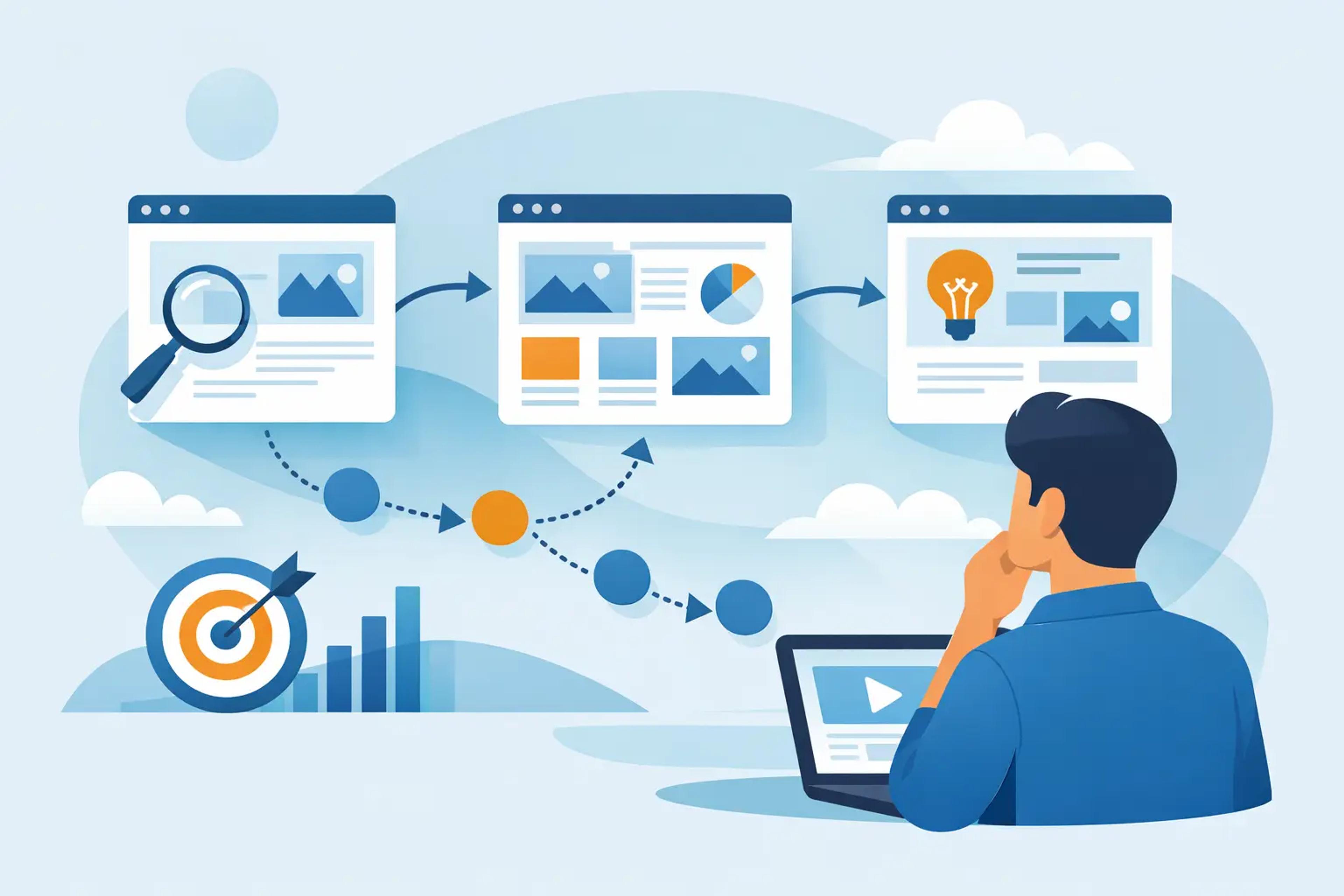
Start With the Pages That End Sessions
Before redesigning menus or adding more links, identify where users leave. In your analytics reports, compare landing pages, exit pages, device types, traffic sources, and locations. A homepage may have healthy depth while a high-volume product page sends most mobile users away after one view.
Look for patterns rather than one isolated number. If paid social visitors view 1.2 pages per session while organic visitors view 3.5, the issue may be message match. If desktop users browse deeply but mobile users do not, inspect loading speed, sticky elements, product filters, and tap targets on smaller screens.
Pay special attention to pages that receive traffic but offer no logical continuation. A blog post without related articles, a service page without supporting proof, or a category page with weak filtering creates a dead end. Every important entry page should answer one question and present the next relevant action.
Match the Landing Page to Visitor Intent
Pages per session often drops before a visitor even sees your navigation. The ad, search query, social post, referral link, or email promise may not match the page they reach. When that mismatch happens, users return to the search results instead of exploring your site.
A search visitor looking for “best CRM for contractors” should not land on a broad software homepage. Send that visitor to a focused comparison, use-case page, or guide with clear paths to features, pricing, case studies, and a demo. The first page needs to confirm, within seconds, that the visitor is in the right place.
This is equally important when you control traffic acquisition settings. Segment campaigns by source, geography, device, and audience intent. A mobile visitor from a social campaign may need a short path to a product collection. A desktop visitor from a high-intent search query may be ready for detailed specifications, reviews, and pricing.
At Traff.org, campaign parameters can be set around source, region, device, schedule, session depth, and time on site. Use that control to test realistic audience and landing-page combinations. Do not treat one preset depth as a substitute for a useful website path. The site still has to earn each additional page view.
Build Clear Paths, Not Bigger Menus
Large navigation bars do not necessarily produce deeper sessions. Too many choices can create hesitation, especially on mobile. The better approach is to design a small number of strong next-page paths for each page type.
For an e-commerce product page, the next step may be a size guide, related products, customer reviews, a comparison table, or the cart. For a B2B service page, it may be industry-specific proof, implementation details, pricing, or a consultation form. For editorial content, it may be a related guide that solves the next problem in the reader’s decision process.
Use internal links in the body copy where they help the reader continue the task. A link placed after a useful explanation usually performs better than a generic “learn more” block at the bottom. The anchor text should describe the destination: “compare monthly and annual plans” gives users a reason to continue; “click here” does not.
Create content clusters around real decisions
A single article can attract traffic, but a connected group of pages gives users a reason to remain. Build clusters around questions customers actually ask before they buy. For a running shoe store, that might include fit, terrain, cushioning, weather, and model comparisons. For a marketing platform, it might include setup, attribution, reporting, integrations, and use cases.
Each piece should lead naturally to another stage of the decision. Avoid adding unrelated links just to raise page depth. Visitors notice when navigation feels manufactured, and analytics may show more pageviews without better conversions.
Reduce Friction Between Page Views
A visitor cannot browse deeply through a slow or unstable site. Core speed issues are especially costly on mobile connections, where a heavy image, delayed script, or intrusive popup can end the session before the second click.
Check page load speed on your most common entry pages, then review what happens after the first interaction. Product filters, search functions, popups, consent banners, and account prompts can all create friction. If an internal link opens a page that loads slowly or loses the user’s selected filters, the browsing path breaks.
Keep the next action visible. On long pages, a contextual call to action can appear after key information, while a sticky navigation element can help users return to categories or search. Use these elements carefully. Aggressive overlays and repeated prompts can hurt the same engagement metrics you are trying to improve.
Mobile deserves its own review rather than a desktop check compressed into a smaller screen. Test whether users can tap related items, read labels, use filters, and return to results without accidental clicks. A clean mobile path often raises pages per session more reliably than any new content block.
Make Search, Filters, and Recommendations Useful
Users who search within a site often have strong intent. If your internal search returns weak results, generic categories, or no helpful alternatives, those sessions will end quickly. Review common search terms and identify queries that lead to exits, refinements, or zero-result pages.
For stores with large catalogs, filters should narrow options without confusing users. Preserve selected filters when visitors open a product and return to the category. Show the number of matching items, use understandable labels, and avoid requiring multiple reloads for simple refinements.
Recommendations should be based on context. A visitor viewing a laptop should see compatible accessories, similar models, and a comparison option. A reader viewing a tax guide should see relevant deadlines, calculators, and related scenarios. “Popular posts” can work, but contextual suggestions usually create a stronger next click.
Measure Quality by Segment
A sitewide average can hide the real opportunity. Break down pages per session by channel, campaign, landing page, device, country, new versus returning visitor, and conversion outcome. Then compare sessions that converted with those that did not.
For example, visitors from branded search may view fewer pages because they already know what they want. That is not necessarily a problem. Visitors from informational queries may need several pages before they are ready to convert. Set expectations by intent instead of applying one universal target.
Use UTM parameters consistently when testing campaigns. They allow you to separate the effect of a new landing page, source, device mix, or geographic segment. Run controlled changes: update one recommendation module, simplify one menu, or revise one landing-page message. Give the test enough traffic and time before making a decision.
Also verify analytics implementation. Duplicate pageview events, single-page application routing errors, self-referrals, and bot traffic can distort the metric. If your data is unreliable, optimization decisions will be unreliable too.
Improve the Next Click First
The fastest way to increase page depth is rarely a full redesign. Start with one high-volume landing page and one clear visitor intent. Remove the mismatch, add the most useful next destination, and verify that the route works cleanly on mobile.
When every visit has a relevant path forward, additional page views become a byproduct of a better experience. That is the kind of engagement worth measuring, scaling, and repeating.